Want to get more from Lightroom without having to attend evening classes? Geoff Harris reveals some power tips and hidden time savers.
Adobe Lightroom 5 has revolutionised the way that many photographers work, particularly those who have to process a large quantity of images at a time.
While the software lacks Layers and other high-end processing and publishing tools found in Photoshop CS, it does a good job of handling everything else. It makes light work of editing JPEGs, but it really comes into its own as an integrated tool for opening, editing and saving Raw files.
Many wedding photographers only ever use Lightroom and I know several who can process over 300 images with it in a single working day. That’s pretty good going. There’s much more to Lightroom than saving Raw files, however. Among other things, you can create slideshows that can be easily shared and even order photo books. As is typical with a lot of modern software, though, the sheer power of Lightroom is not immediately obvious, and the myriad options can get confusing. Here’s a quick guide to some of its less obvious, but still very useful, tools to help you work smarter.
1. Save time with Quick Develop
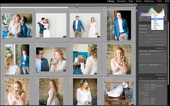
Once you have imported your images into Lightroom (either by importing from a card or by simply dragging and dropping files onto the LR logo) it’s tempting to jump straight into the full Develop mode for editing. Instead, it’s worth taking a step back and checking out the Quick Develop tools in the Library mode. These are great for applying quick fixes to a range of selected images, saving a lot of time. Say you have taken a series of images in similar light but want to change the white balance on all of them; simply select the images then choose a new White Balance setting and bingo! You can also apply specific exposure tweaks in this way, or apply Presets (either built-in or third party) without having to do it image-by-image.
2. Sorting out your workspace

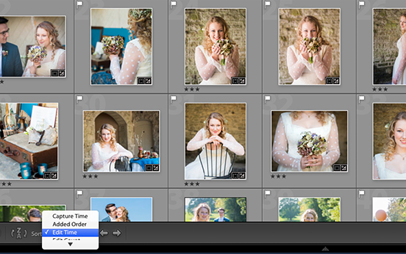
Although Lightroom is pretty streamlined considering the power it packs, you need to tell it how you wish to work. It’s also very easy to turn key settings off by accident, which is one of the more annoying aspects of the program. If you have imported a large number of images and wish to view them as thumbnails, go to Grid view in Library mode by hitting the keyboard shortcut G, before using the Thumbnails slider at the bottom to alter their size. This is invaluable if you have a small screen, but make sure the thumbnails are large enough when you are selecting which images to keep. To the far left of the Thumbnails slider is the Sort button, which lets you arrange images according to date and time taken, most-recently edited and so on. This is another real time saver as you can see what images you worked on most recently.
3. Checking sharpness
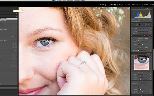
Lightroom being Lightroom, there are many ways to zoom in and check the sharpness of critical areas in your images. I prefer to keep it simple. In Develop mode, click 1:1, to the immediate left of the main image window. This takes you right in at 100% so you can instantly see whether you got the right focus point or shutter speed, for example. Apply some common sense with this, though: if you are printing a close-up of a person, obviously the eyes need to be pin sharp at 100%; but with the eyes of somebody in a crowd shot, for example, you have a bit more leeway. It’s also worth remembering that not everyone views images at 100%. When sharpening your image in the Develop module, make sure the relevant area is visible in the smaller window so you can see the effects of your changes in key areas – in this example, the bride’s eyes. The same goes for noise reduction – just move your mouse cursor to navigate around this mini window.
4. Cropping and straightening
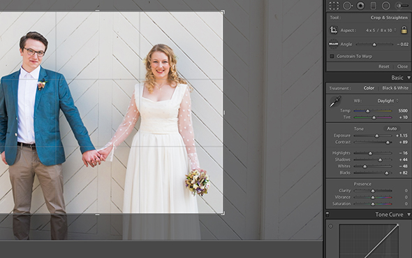
It’s surprising how many image-editing programs make such a meal of a simple job like straightening an image, but Lightroom makes it really easy. Simply select the crop tool in Develop, and click in the area outside the boundaries of the image. If you hold down the mouse button, you can quickly straighten up an image by eye, or add an angle for creative effect. The Angle tool underneath the Aspect logo does the same thing but I find it less intuitive to use. Don’t forget to make full use of the options available under the ‘As Shot‘ pull-down crop menu. Remember, whenever you see up and down arrows next to something in Lightroom it means that there are lots of hidden options. It sounds obvious but it’s very easy to miss.
5. Tone Curve secrets
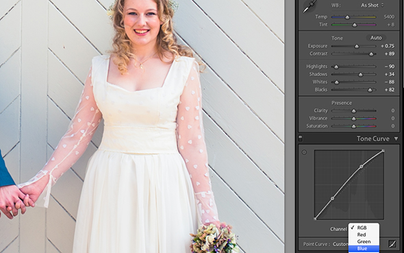
A great example of all this hidden power can be found in the Tone Curve box in Develop mode. At first glance this is a pretty simple tool that works in a similar way to the Histogram at the top; instead of dragging the histogram peaks around, you are dragging the Tone Curve line up or down. Drag down to darken, up to lighten and so on. A classic gentle S-shaped curve works well for many images. But did you know that you can also apply the Tone Curve to an image by using the funny little ‘target’ icon to the left of the tone-curve graph? With it selected, drag your mouse up to lighten, or down to darken. Meanwhile, the up and down arrows next to Channel enable you to work on individual RGB (Red, Green, Blue) channels, while you can quickly add Strong Contrast or Medium Contrast (or any of your Presets) via the Point Curve option.
6. Automasking
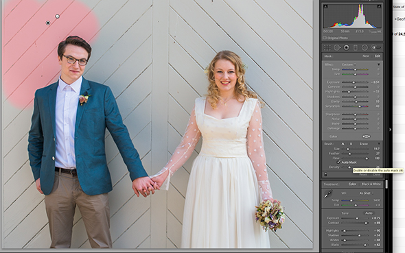
To adjust a very specific area of an image, you need to use the Adjustment Brush in Develop mode. This is pretty self explanatory: hit ‘K’ and you can see the mouse cursor change to a target crosshair. Look to the right, and the pull-down menu by Custom enables you to set a wide range of parameters, covering all aspects of exposure. You then paint over the relevant area to make the adjustment. Say you only wanted to work on a larger area, such as the background of an image, darkening or lightening it as required. If you tick Auto Mask, Lightroom will only apply the effect to the area you are painting over. As you can see here, we are painting over the wooden slats on the background, while leaving the groom alone (actually we caught a bit of his head but it’s not too bad). Using Auto Mask is a great way of darkening skies in a landscape, too. Make sure you set the brush size correctly, though – too small and it will take you longer to select the area, too big and you can accidentally paint over areas that you don’t want to include.
7. Colours and split toning
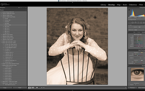
The HSL (Hue, Saturation and Luminance) box makes it a breeze to work on colours in Develop mode, and I find the Luminance tool in particular helps to add richness and depth to primary colours. Don’t forget the powerful Split Toning options, too. These can be a bit intimidating at first, but a good tip with Split Toning is to select Selenium Tone under Presets/Lightroom B&W Toned Presets. It gives you a great starting point for applying subsequent split-tone effects – or just subtly altering the hue of an image to give you a signature style. Installing third-party Presets is an easy and relatively cheap way of greatly expanding the power of Lightroom, but bear in mind that they are often only a starting point rather an an instant fix. Some can give skin tones a nasty orange hue, too. For my money, MastinLabs.com offer the best Lightroom presets for portraits at the moment, but if you don’t want to pay, look out for various free ones available online.
8. Sharing tips
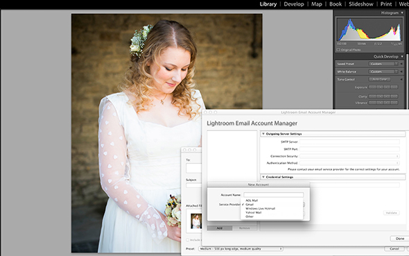
Did you know you can email images directly from Lightroom? Command + Shift + M (Mac) | Control + Shift + M (Windows) enables you to use your proprietary email program (such as Apple Mail) but if you are using a mainstream webmail program such as Gmail, use the ‘From’ option to choose ‘Go To Email Account Manager’. Click the Add (+) icon in the lower left and, if you’re using one of the four programs listed (AOL Mail, Gmail, Windows Live Hotmail or Yahoo! mail), select it from the list. As mentioned at the beginning, don’t forget the wonderful Slideshow option, which is one of the main menu choices. It makes it very easy to create a slideshow of images that you can easily share on a website or via social media and you can even add a music track. For zero extra cost to you, it’s a great extra to give to wedding or corporate clients.
About the Author
Geoff is an experienced photography journalist, and recently stepped down as editor of Digital Camera, the UK’s best-selling photography magazine. He now writes for a range of publications. Geoff is a keen travel and portrait photographer, and a Licentiate of the Royal Photographic Society.


