Add drama and impact to your people pictures by using these simple and effective shooting techniques
Is your portraiture lacking a certain je ne sais quoi, no matter how hard you try? Use some of the quick tips below for dynamic results from every shoot.
1. Concentrate on the eyes
Instinctually we are drawn to eyes when we look at an image. Accordingly, getting them right in a portrait can make a massive difference to whether the shot is successful or not.
This process usually begins with making sure that they are the sharpest part of your photo, unless you’re purposely trying to draw a viewer’s attention to something else in the scene. Use single-point AF and position the active focus point over the eye that’s closest to the camera, before half-pressing the shutter button to find sharp focus on it.
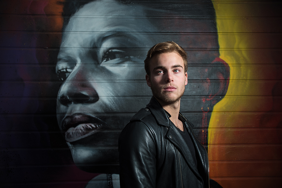
Consider where your subject is looking before you take your shot too – direct eye contact will feel intimate and give impact to an image, while a mid-distance stare towards the edge of the frame may suggest the subject is in deeper or more reflective thought. This simple difference has real power to dictate the emotion conveyed by your shot.

Subjects don’t always have to stare straight down the barrel of your lens.
2. Try an off-centre composition
Many people begin taking portraits with their subject positioned in the middle of the frame as a matter of course. We do it for school and passport images, and it seems natural that the most important thing in a photo should be at its centre. While central compositions can make a subject appear powerful and strong, off-centre compositions can be much more creative and interesting.
One of the easiest ways to successfully start taking portraits off-centre is to position your subject using the rule of thirds – for those who don’t know, this rule splits your frame into nine even rectangles using two horizontal and two vertical lines.
By placing your subject along one of these central lines, and placing the eyes at one of the “power points” where the horizontal and vertical lines intersect with another, you can produce a shot with a pleasing balance between the subject and the space around them.
Many devices will allow you to display a rule-of-thirds grid through their viewfinder or rear monitor while shooting – just activate it in your camera’s menu.

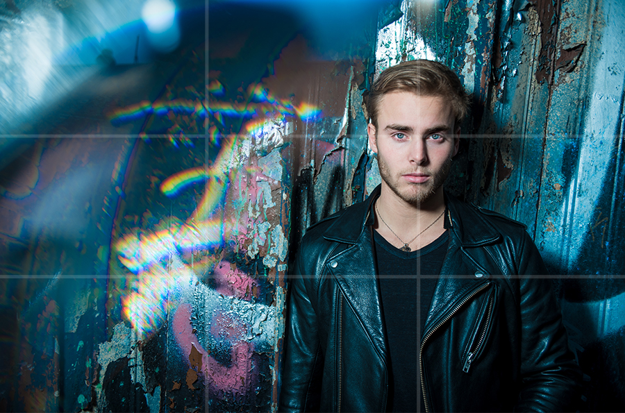
In this image, the subject is positioned along the right third or the image, with his eyes sitting along the intersection with the top horizontal line.
3. Consider the background
One of the fastest ways to ruin a portrait is to position your subject in front of a background that distracts attention away from them. In fact, it’s this considered awareness of the scene as a whole that’s one of the biggest differences between something that looks candid and something that looks professional.
When choosing a location for your photo, try to find either a background that’s clean and clutter-free, or one that compliments the subject and the scene that you’re trying to set.
While a clear contrast between subject and background can produce eye-catching results, such as a ballerina pictured in a derelict building, it usually needs to be a bold enough difference that the intention of the photographer in combining the two is obvious.
Wide apertures can help you to produce shallow depths of field in your photos, causing a scene’s defocused areas to fall into blur. This technique can be a great way of creating separation between a sharp subject and the world behind them, focusing attention on them and masking any distractions.

The defocused background gives the subject context, but its lack of sharpness means that attention on the subject is maintained.
4. Consider the foreground
Including elements in the foreground of a portrait is a fantastic way of adding depth and giving it a cinematic feel. Placed carefully, things like plants and walls can frame a subject to increase emphasis and draw a viewer’s eyes into them.
Just like with the background of scene as mentioned earlier, a shallow depth of field produced by using wide apertures can help to remove any distraction caused by this foreground, as the sharpest part of the image remains the subject themselves.
Including a foreground also helps to place the subject more firmly within a location and create a sense of scale, both important for a sense of realism.

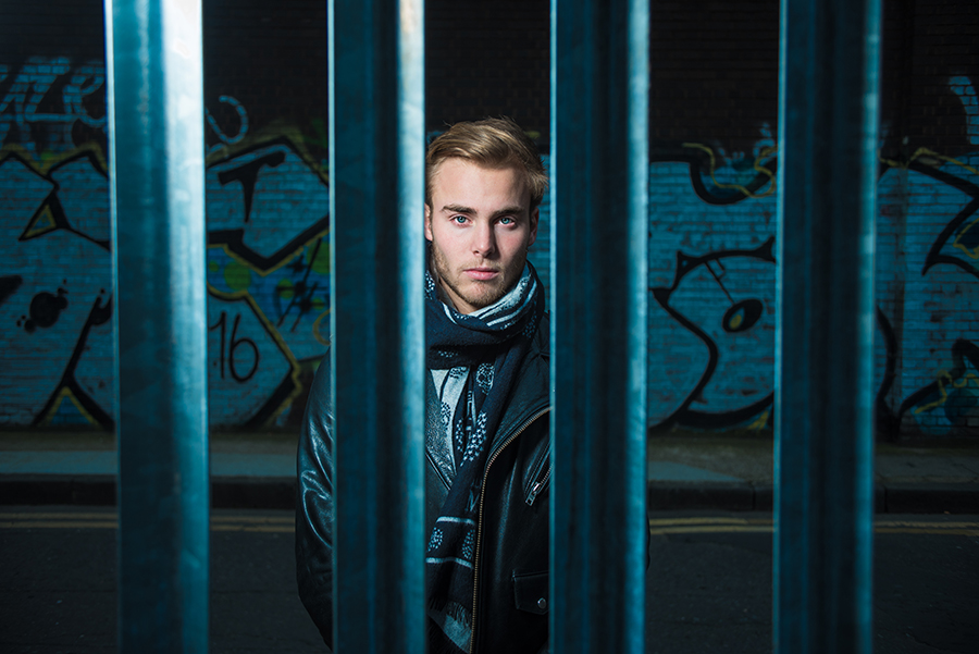
With a sharp subject sandwiched between a blurry foreground and background, this image has a real sense of depth to it.
5. You don’t always have to fill the frame
Just because your image is a portrait, doesn’t mean that you have to fill the frame with a face. In fact, unless you're producing some kind of beauty image or profile image, it’s usually best not to.
Including more of your subject’s environment helps to give them character, and helps to build a story about where they are and what they do, which in turn will intrigue viewers. Sure it can be a challenge not to lose small subjects in busy scenes, but use the background and foreground tips above and it’ll be clear who the focus of your image is.

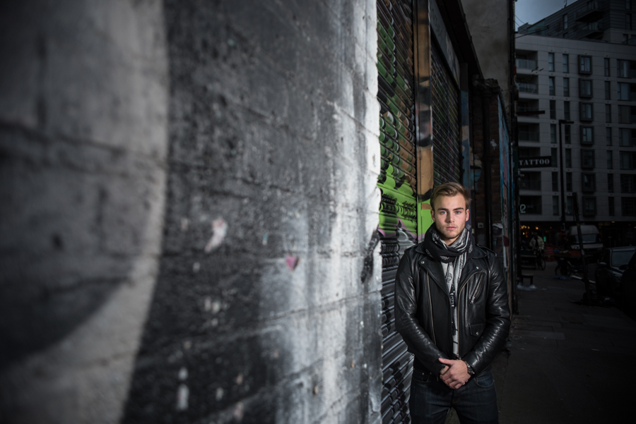
The subject may only take up a small part of this portrait, but it’s clear that the image is focused on them.
6. Switch up your angles
Generally speaking, images taken from the subject’s eye-level will feel the most intimate and balanced and look the most flattering and natural. Depending on the height of your subject, this can require you to get higher or lower in order to get parallel with them.
However, even fairly subtle shifts in perspective can have a significant impact on the balance of power in an image, and in turn how a subject is perceived.
High shooting angles can have a slimming effect on a subject’s face when it’s tilted upwards (which is one of the reasons it’s a popular choice for selfies), but it can also make person pictured look smaller and less intimidating. This angle can be good for children, emphasising their small stature, but is less likely to work as well for a subject you want to appear powerful – say, a boxer or a company director.
The opposite is true of low angles, where body size seems enlarged and the subject seems more intimidating, looming over the viewer.

A low angle has given the subject a more imposing feel in this image.
About the Author
Matt Higgs has worked for Practical Photography and Digital Photo magazines, and his live music images have been featured in numerous respected music publications including Rock Sound, Guitarist, Guitar Techniques and Akustik Gitarre. www.matthiggsphotography.co.uk.
Related articles
How to Take Black and White Portraits
Focus on Family Portraits
How to Get Started with Environmental Portraiture


