With the weather in the UK still on the chilly side of comfortable, it's always nice to have some indoors photography to fall back on, and unless you're extremely efficient when it comes to recycling, the chances are that you may have some ideal subject matter sat in your kitchen at home. Even if your recycling bin/tub was emptied this very morning, your kitchen cabinets may well offer up some suitable material anyway. Yes, we're talking glass.

As it happens, I still have some empty glass bottles waiting to be recycled from last Christmas, but I also have a small collection of interesting bottles that I've collected over the years for this very purpose. You see, glass bottles and glass, erm, glasses are ideal still life subjects. They tend to be relatively small, so require little space, and can be lit with just the simplest of lighting arrangements for some effective images.
So, if you're struggling for inspiration, or just want an excuse to stay indoors without accusations of being a "fair weather photographer", have a look at some of these ideas.
Backlit lighting
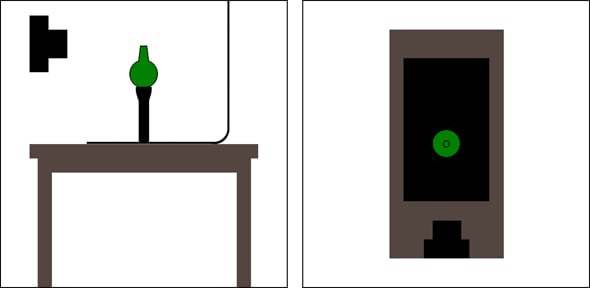
A really easy and straightforward way to shoot glass is to backlight it. This can be done using flash or continuous lighting, the latter being easily supplied with something as simple as a desk-lamp, although in the past I have used the light from a slide projector and an entirely white monitor screen to supply the illumination.
Plain glass bottle

For the shot above, the glass bottle was placed on a dark table in front of a white wall. A flash was then used to illuminate the wall behind the bottle, giving the glass a black-rimmed effect. In order for this to work, there needs to be enough distance between the white wall and the bottle so that there is not too much light spill onto the glass. If getting enough distance is a problem, it's possible to use black card to "flag" the light on the sides of the bottle. This prevents light from spilling where it shouldn't and also helps create the black edges to the glass. If your glass is looking too silhouetted, you can use a piece of white card to deliberately reflect some light back in. You may need to try adjusting your exposure manually to get the right effect; you don't want the bottle to be too bright or it simply becomes bleached out.

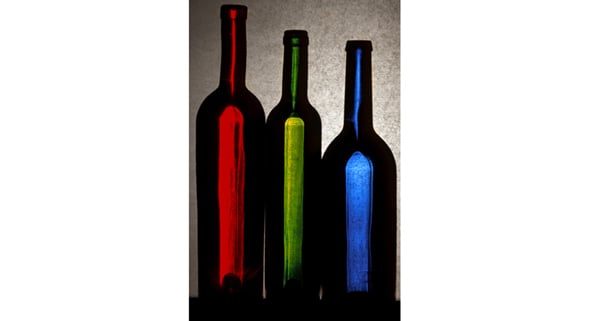
Coloured bottle projection

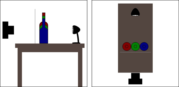
Although this was the shot that I created using the light output from a slide projector (without a slide in it, obviously) you could just as easily create this effect with a standard tungsten lamp. Your light source, whatever it may be, is placed behind the coloured bottles and pointing straight at the camera. A piece of tracing-paper, grease-proof baking paper or, as was the case with this set-up, a sheet of dry-mount tissue is then placed right in front of the bottles so it is virtually touching them. If you have somebody available to lend a hand they can hold this sheet of paper in place, otherwise you may need to knock-up some sort of support - an un-bent wire coat-hanger plus some sticky-tape and Blu-tack will do the trick - very Blue Peter. By experimenting I discovered that the effect works best if you fill the bottles with water - presumably something to do with the way the light is refracted, but if somebody wants to offer a more scientific explanation then I'm all ears. Whatever the reason, water seems to help. Once again, a bit of dabbling with the exposure may be required and, as always, shooting in RAW helps as you can make fine adjustments in post processing.
Lightbox lighting
Like many photographers who used to shoot on slide film, I own a lightbox. It's only a tiny lightbox - the illuminated surface area measuring just 5x4 inches, which was the largest transparency I ever needed to view when I bought it many moons ago. You can still buy these lightboxes, or something similar at least, on the Wex Photographic site - Hama make one virtually identical to mine. But with my days of shooting on film some way behind me, it'd been a while since my little lightbox had been taken out of the cupboard and dusted off. A quick wipe-down and 4 new AA batteries later and I was ready to put it to a slightly different use.
Simple shot glass
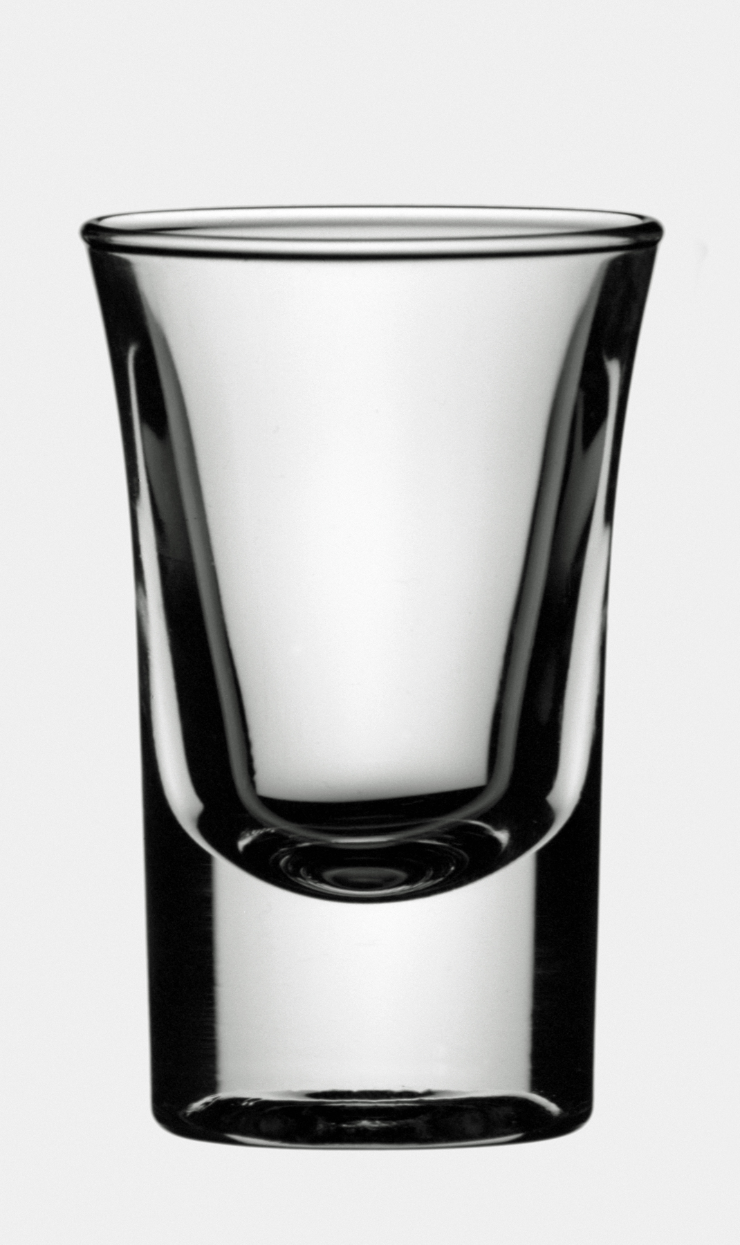
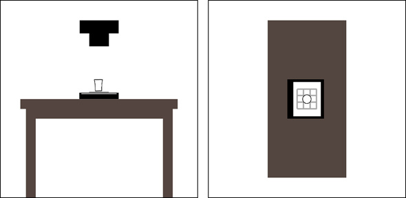
There's really not a lot to say about this shot, so simple was it to set up. The shot glass was laid in the centre of my little lightbox in a dark room. The camera was positioned on a tripod directly above the glass and pointing straight down at the lightbox. I pushed the shutter and took the picture. Umm, I'm struggling to think of much else to say. Nope, that's it really. A simple set-up resulting in a simple image which I quite like - the simplicity of it and all that...

Shot glass magnifier

Using the same shot glass as above, this shot just required the glass to be stood upright on the lightbox. Well, I say that - the image that resulted from simply changing the position of the glass was a bit bland and nothingy. The benefit of digital is that experimenting with shots is so easy and, unlike film, cheap. I moved the shot glass about, tried different positions and introduced additional items into the mix. It was when I placed a chrome wire grid shaped coaster under the glass that I suddenly found I had a shot worth taking. Once again, really simple, but the geometric patterns appealed to my simple aesthetic tastes.
Maglite lighting
I can't remember how I first found out, or begin to imagine what I was doing when I discovered this, but it transpires that several of the glasses in my cabinet at home fit perfectly into the front of my Maglite torch. Shot, Sherry and Spirit glasses alike all nestle quite happily and securely in the end of the torch meaning that, with a bit of careful balancing, I can stand the Maglite on end and use it to illuminate these glass objects from beneath. If sales of Maglites increase as a result of this coincidence, I want commission. Naturally, other torches are available and who's to say one of those won't better suit the contents of your drinks cabinets?
Water bottle

As I mentioned above with the coloured bottle shot, filling the glass with water seems to improve the spread of light. That's really all that was required for this photo - an interestingly shaped bottle full of water balanced carefully on the end of a Maglite torch against a black backdrop in a dark room. It is of course very important that you don't knock the surface on which the torch is balanced. To prevent the torch, my camera and surrounding floor area from getting wet, I found it safer to shoot from a short distance away to avoid the chances of accidental contact resulting in spillage
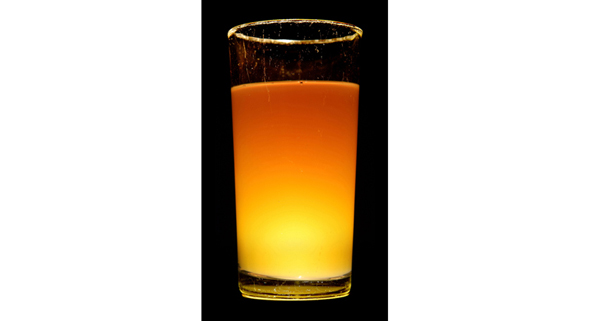
Glowing liquid

Adding water to the bottles to change the way the light affected them made me think - what would other liquids do? The result of this thought process was a long glass almost full of neat orange cordial balanced precariously on top of my upright Maglite. Now any spillage would be potentially far more hazardous and sticky, but I really liked the slightly neon-looking glow I was getting, so persevered with the shot, being sure to move slowly and carefully around my subject and once again shooting from some distance away.

Digital composites
I briefly touched on a few advantages of digital above - namely the fact that you can experiment as much as you like for minimum cost and also play about with your images using software afterwards. In general, I'm not a huge fan of digital manipulation for its own sake, but that's not to say that I don't like to have a fiddle with my images once in a while. Given that some of the shots I'd taken with the glass subjects were rather minimalist on their original form, I thought I'd make a few subtle tweaks and see what I could create.
I then decided that subtlety was for cowards and went crazy. Photoshop can get you like that...
Anyway, here are some of the shots I describe above given a digital twist or, in some cases, an utter mangling. Don't get me wrong - I'm still happy with the original shots, but what's hard-drive space for if not filling?
Textured bottles
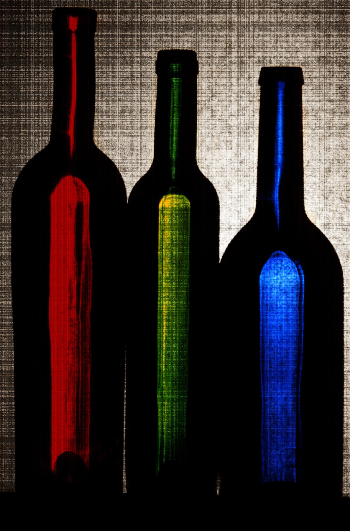
I liked the oldy-worldy, slightly painterly look of this photo, but just wondered if I could make it more so. Photoshop Elements (I was using version 8, but this applies to most) offers a wealth of filters that can be digitally added to images to create different effects so I, not knowing exactly what I wanted, tried different variations until I found one that I liked.
The filter that worked for me was the 'Grain' option found in the 'Texture' group of Photoshop filters. After creating a copy of the background as a layer (Ctrl+J) I selected the 'Grain' filter' and set 'Horizontal' as the Grain Type, with the Intensity and Contrast sliders set to maximum. With this filter applied to the image I then reapplied the 'Grain' filter, this time choosing 'Vertical' from the Grain Type options.

This effect was heading in the right direction but was a little too heavy. I experimented with adjusting the opacity of the top layer (using the numeric keypad) to reveal the original, filter-free image underneath, and tried different layer blending modes (Shift key plus the + or - key to cycle through the options). In the end I kept the layer opacity at 100% and selected the Softlight blending mode to combine the top layer with the background, before flattening and saving the image.
For a full Photoshop walkthrough, please click here.
Tinted glasses
The problem with really simple images is that after a while their simplicity can become a little, well, dull. This greyscale image of a shot glass is nice enough, but is perhaps a little too grey and unexciting. Although I like the gentle contours and shape of the glass, I couldn't help feeling that it might benefit from a subtle splash of colour.

After changing the image mode from Grayscale to RGB Colour (Alt+I, Alt+M, then Alt+R) I created a duplicate layer (Ctrl+J), used the Magic Wand tool to select the grey background area of the top layer and then inverted the selection (Ctrl+Shift+I) so that the glass itself was selected. The next step was to pop-up the Hue/Saturation adjustment window (Ctrl+U), click the Colorize box in the lower right corner of the window and then slide the Hue control until I found a colour that I liked.

Having given the shot glass image a delicate red tint, I repeated the process a further 2 times to give the red glass a blue and a green companion. After increasing the canvas size to 300% and laying the glasses out in their RGB order I flattened and saved the creation.

For a full Photoshop walkthrough, please click here.
Neon glow
Creating the RGB shot glass image above demonstrated how easy it was to create a composite image by using duplicates of the original shot and simply adjusting the colours slightly. With the Glowing Glass shot already looking rather neon, I set about creating a composite that anyone who remembers the 1980s fondly would be proud to hang on their wall.
Firstly I duplicated the background image (Ctrl+J) and then expanded the canvas to 1200% of its original width to the right. I then opened the Hue/Saturation window (Ctrl+U) and adjusted the Hue control slider to a value of +30. This had the effect of changing the colour tones of the top layer slightly and with this done I dragged the layer to the right so that both it and the original image could be viewed one next to the other. I then duplicated the top layer (Ctrl+J again) and repeated the colour change procedure. This whole process of duplicating the top layer, altering its colour and positioning it on the image was repeated until I had 12 differently coloured glowing glasses laid out in a row, and looked something like this:


This final elongated image is all very nice and everything, but having completed this process I decided that I wanted something a little more print friendly, so altered the dimensions of the canvas and rearranged the layout of the glasses. As you've probably guessed by now, I then flattened and saved the image.
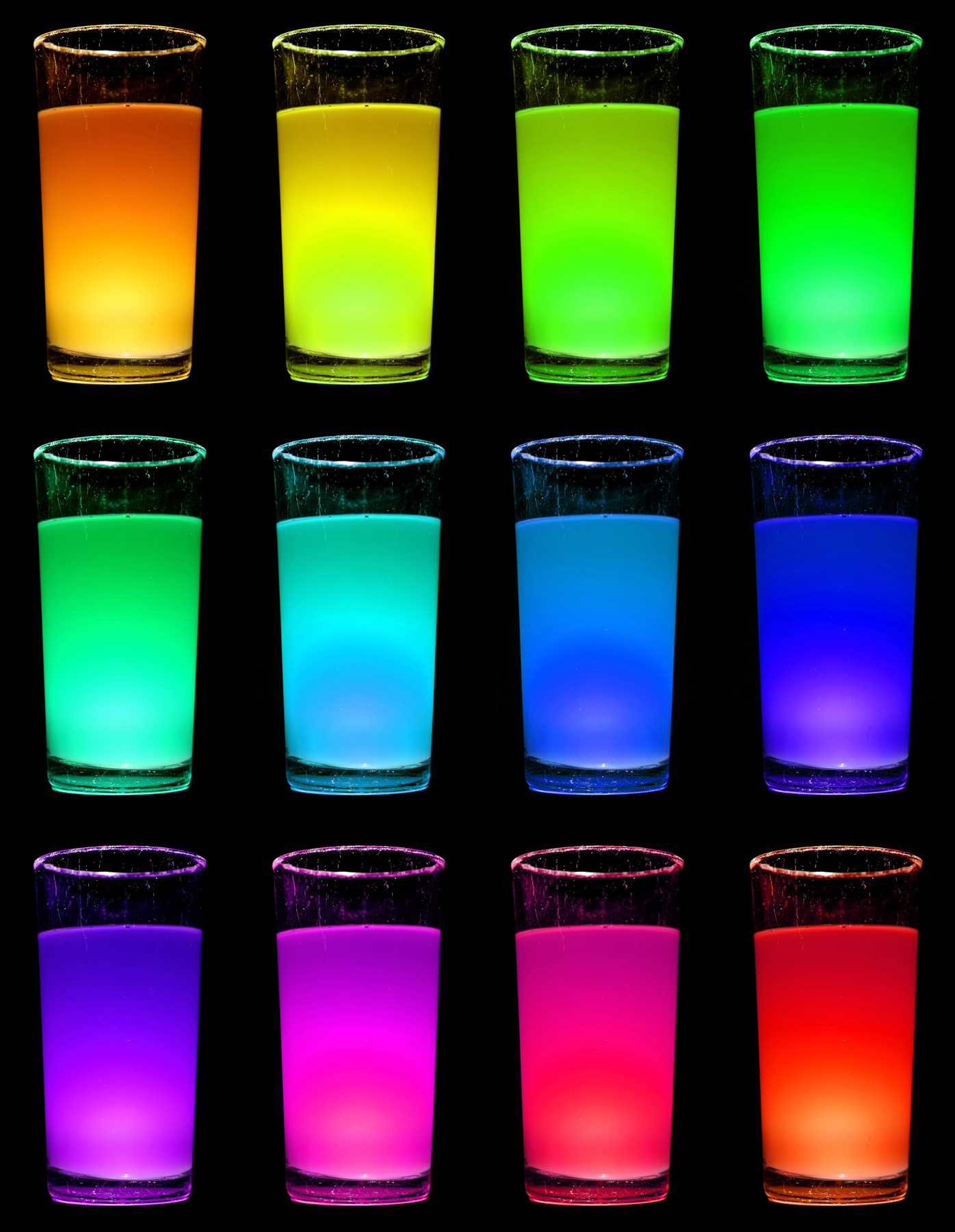
For a full Photoshop walkthrough, please click here.
Potion bottles
As I write this I'm aware of what a sad thing it is I'm about to say - I really like this bottle. You may think that having any particularly strong feeling towards a glass container suggests I should get out more, and you're probably right. This little round-bottomed bottle was brought back from Hungary by my brother after a trip there last Christmas. At the time it contained a sticky, syrupy liqueur of some kind that tasted quite pleasant and produced a warm, fuzzy feeling within seconds of consumption. But what I really like about it is that it reminds me of some kind of potion bottle that you might find hidden away on an old bookshelf covered in dust and cobwebs and surrounded by ancient leather-bound spell books and jars of snake-eyes and bat-ears. Yes, I should definitely get out more...
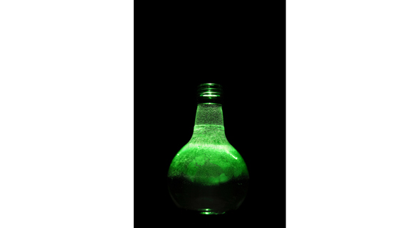
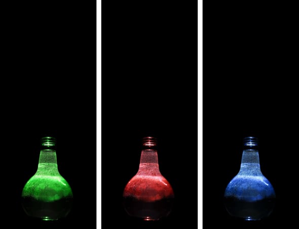
Unlike the digital manipulations that have gone before, I knew exactly what I wanted to do with this one and the first step was to increase the height of the canvas to give some more space above the bottle. With this done I used the Hue/Saturation control (Ctrl+U) to create a red and a blue version of the green bottle in the same way that I had altered the colour of the shot glasses before.
From a previous photo experiment I have a series of photographs of coloured smoke saved on my hard-drive, waiting for an opportunity to come out and be used. This was their chance.
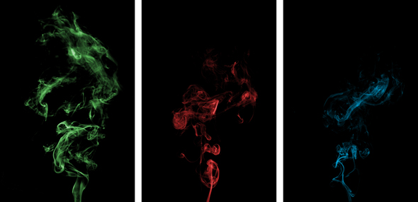
I added an appropriately coloured plume of smoke to each of the 3 bottles, moving, rotating and adjusting the size of the smoke layer to fit correctly. I then changed the blending mode of the smoke layers to Screen to make the combination of the glass and smoke look more natural. With the 3 bottle/smoke composites completed each was flattened.
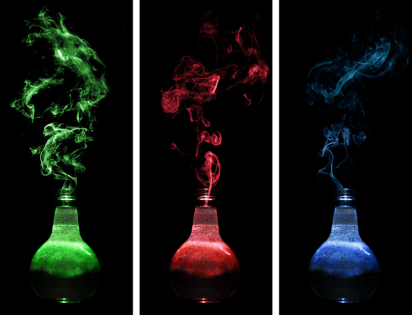
The final step was to combine all 3 bottle images in one. I started with a square black canvas and dragged and dropped the bottle images on to it. I knew I wanted the green bottle with its slightly more ornate plume of smoke up front, so I reduced the size of the red and blue versions slightly and positioned these layers behind and to each side of the green bottle layer. Finally the blending mode of all 3 bottle layers was changed to Screen, allowing the coloured smoke plumes to overlay and entwine with one another, before the image was - yep, you've got it - flattened and saved.

For a full Photoshop walkthrough, please click here.
Bottoms up
I hope that this has proved, if nothing else, that getting interesting shots doesn't have to be complicated, and that it's possible to get creative with your photography without even leaving your house.
I am aware that digital manipulation isn't for everybody and that the final results of Photoshopped images are often a matter of taste - a bit like Marmite. For that reason I've avoided going into huge, lengthy descriptions of the Photoshop processes involved in each of the manipulated images, but if you do want more in-depth, detailed step-by-step information, let me know.
Other than that, raid your recycle bin, empty your cabinets and see what you can create - we'd love to see the results.


