The Loupedeck team has announced the Loupedeck+ an upgrade to its existing photo editing console that boasts more customisation options, more software compatibility and a superior build quality
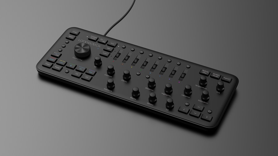
The Loupedeck+ features a new selection of presets from Loke Roos.
ORDER THE LOUPEDECK+ TODAY
Update: 26.06.2019
If you own Loupedeck’s popular photo editing console, chances are you use it with Adobe Photoshop. However, the Loupedeck+ wasn’t officially integrated with Adobe’s Camera Raw (the first step in many Photoshop users’ workflow). Today, all that’s changed because Loupedeck has officially announced Loupedeck+ integration with Camera Raw. Here are just some of the functions the Loupedeck+ is able to control…
- Label images with stars and colours
- Control basic adjustments such as exposure, contrast and temperature
- Use the console’s HSL scroll wheels to colour grade images
- Activate a variety of functions including tone curves, sharpening, noise reduction, lens corrections, vignette and split toning
Camera Raw integration for the Loupedeck+ is available today.
Update: 14.03.2019
Loupedeck has today announced that Adobe Audition and Apple’s Final Cut Pro X are now compatible with the Loupedeck+. Users are simply required to download the latest firmware update to make use of this added functionality. Paired with the editing console’s existing compatibility with Adobe Premiere Pro, the update is sure to pique the interest of the filmmaking community and colourists in particular. The accessory’s compatibility with Final Cut Pro is surely the highlight, and Loupedeck has revealed the following functions…
- Faster and more intuitive video editing and colour correction
- The flexibility to create configurations to fit the user’s workflow
- Export/import personal Loupedeck configurations and transfer them to another computer
- Use colour wheel workspace compatibility for colour grading
- Flexible timeline navigation, content trimming and clip adjustment
- Customise console buttons to preferred Final Cut Pro shortcut demands or use pre-installed functions
- Take advantage of 400+ additional functions
The Loupedeck+
20.06.2018
It’s fair to say that the original Loupedeck garnered quite the buzz. In fact, the Finnish photo editing console’s crowd funding campaign ended a whopping 488% above target. Around a year later and with a reported 15,000 Loupedeck users twisting, pushing and scrolling their way through each edit, the team that boasts experience from consumer electronics giant, Nokia, is back with the Loupedeck+.
The Loupedeck+ is being marketed as an update to its predecessor and not an entirely new model, but with additional software support, many more customisation options and a better build quality, consider this a serious upgrade. Retailing at a similar price to the original Loupedeck, the Loupedeck+ should be a no-brainer for those looking to buy into the system for the first time. But, is there enough here to warrant a purchase from existing Loupedeck users? Let’s look at the facts…
System requirements
- Adobe Lightroom 7.4 (or later), Skylum Aurora HDR, beta integration with Capture One.
- Additional photo-editing software compatibility under development.
- Windows 10, Windows 8.1, Windows 7
- Mac OS 10.12 or later
- Internet connection needed for Loupedeck software download
- USB 2.0 A
- 39.5x15x4cm (0.67kg)
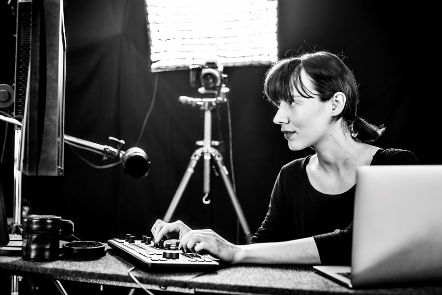
Loupedecks let you focus on what really matters, the image on your screen.
What’s a Loupedeck?
If you’ve never heard of a Loupedeck before, you’ll find a detailed description here. For those who want the condensed version, a Loupedeck is a photo editing console – a type of controller with physical buttons, dials and scroll wheels. It's optimised for use with compatible forms of editing software (see system requirements) and is designed to speed up workflow, and provide an enhanced and more enjoyable method of control.
One of the many benefits of using a Loupedeck is the freedom to edit an image in full-screen mode, without the distraction of any menus, sliders or toolbars. Even if you prefer to work alongside the various menus and sliders, you may still find a dial to be much more accurate when performing fine adjustments. Try moving the Clarity slider by precisely three points using a mouse, it's difficult...
Loupedeck+ setup
Inside the box you’ll find a quick start guide and the console itself (the USB cable is attached). The whole idea of a Loupedeck console is to streamline the editing process, so it’s fitting that the device is simple to use and easy to set up. Loupedeck+ boasts plug and play functionality, and is configured for immediate use. As soon as I'd downloaded the Loupedeck software from the Loupedeck website, I plugged in the device, booted up Lightroom Classic CC and started editing.
At launch, Loupedeck+ is compatible with Lightroom Classic CC and Skylum Aurora HDR. However, additional software development is reportedly on its way and it looks like the beta for use with Capture One is set to launch before the end of June.
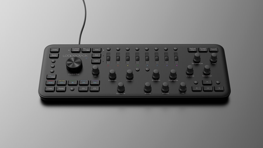
The physical differences between the Loupedeck and Loupedeck+ aren't immediately noticeable, but closer inspection reveals quite a few changes.
Build quality
At first glance the Loupedeck+ looks very similar to its predecessor. The consoles appear almost identical in size, although the Loupedeck+ is lighter. Perhaps the most striking difference is the absence of the silver surround in favour of a tidy all-black appearance. On closer inspection you’ll find a slightly different button layout and the most important physical change, mechanical rectangular buttons.
The new buttons are more responsive, which is a huge boon as some users found the original Loupedeck’s buttons to be slightly unresponsive unless pressed directly in the centre. But Loupedeck hasn’t stopped there, the new buttons are also more comfortable – they spring up when released and feel more substantial when pressed. Finally, their raised profile makes them easier to find by touch, particularly useful for when you're concentrating on the screen.
Button layout
As for the control layout, the Loupedeck+ features 24 rectangular buttons, as opposed to its predecessor’s 25. However, the Loupedeck+ features 16 small circular buttons (opposed to the former’s 11) and an additional small dial. Starting from the bottom right-hand corner, Copy, Paste and the Fn button remain, however, the Pick and Zoom buttons have been replaced with the customisable C1 and C2 buttons.
Each of the five colour label/star rating buttons are still present, but a third function has been assigned to each button (toggled using the Fn key). These functions are Shift, Ctrl, Windows key/Command key, Alt and Tab. These are a welcome addition providing five more instances where you won’t be reaching over for that keyboard. Moving to the top left-hand corner, Undo and Redo remain, but the Brush button below has been replaced with three customisable circular buttons, L1, L2 and L3.
The Full Screen button which sat just above the original Loupedeck’s logo has been moved to the opposite side of the console and renamed Screen Mode. Its replacement is a fancy new Custom Mode button (more on that later). The Colour/Black and White, Hue, Saturation and Luminance buttons all remain, as do the eight preset buttons and accompanying scroll wheels. The two small customisation buttons below, C2 and C3, are now C3 and C4, with the new addition of C5 and C6 flanking the up arrow key. Left of the arrow keys, the Zoom button has been removed entirely, and in the top right-hand corner the Before/After and Export buttons remain.
The dials remain largely the same, with the exception of the White Balance dial which is now Temperature and the C1 dial, which is now D1. The additional dial, D2, sits to the left of the arrow keys – both D1 and D2 can be customised for functions in Develop mode. That leaves the chunky Control Dial, which looks snazzier, thanks to a subtle aesthetic change. As for its functionality, it still clicks and rotates, and can now be assigned a variety of tasks including image rotation, cropping and a shortcut to the Develop mode.
Lightroom custom button defaults
Custom Buttons (default):
- C1 – Flag: Pick/Unpick
- C2 – Flag: Reject/UnReject
- C3 – Auto Settings: Tone
- C4 – Auto Settings: White Balance
- C5 – Zoom: In/Out
- C6 – Quick Collection: Add/Remove
- L1 – Adjustment Brush
- L2 – Radial Filter
- L3 – Graduated Filter
Custom Buttons Fn (default):
- C1 – Rotate: Left 90 °
- C2 – Rotate: Right 90°
- C3 – Info: Show Overlay
- C4 – Info: Show Clipping*
- C5 – Open image in Photoshop*
- C6 – Quick Collection: Show QuickC
- L1 – Spot Removal
- L2 – Activate: Loupedeck setup
- L3 – Module: Library/Develop
*Not available in Library mode
Custom Dials (default):
- D1 – Dehaze (click to reset)**
- D2 – Sharpness Amount (click to reset)**
- Control Dial – Move Left/Right (click to crop)*
*Library mode only**Develop mode only
Custom Dials Fn (default):
- D1 – Vignetting (click to reset)**
- D2 – Noise Reduction (click to reset)**
**Develop mode only
Custom Mode
The Loupedeck+ sports many more customisation options than its predecessor. Not only can existing customisation buttons perform more functions, but most of the console’s buttons and dials are now open to at least some form of customisation. Loupedeck has quoted two dedicated customisable dials and seventeen customisable buttons, but the reality is far greater. In fact, every single dial is customisable to some extent. 11 of these are accessible via the new Custom Mode button. Custom Mode is only available in Develop mode and a useful LED light illuminates to show that it’s active.
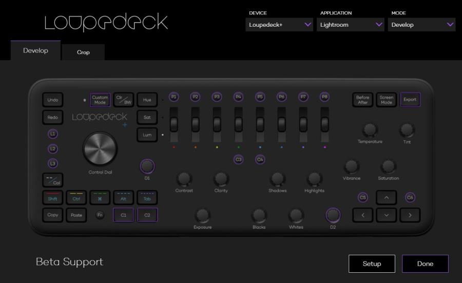
Want to customise a button? Simply click on the desired group via this intuitive menu screen.
Loupedeck Software 2.0
Whether altering Custom Mode, or dedicated customisation buttons or dials, all custom settings are adjusted via the new Loupedeck Software 2.0. This easy-to-use interface presents a top-down perspective on the Loupedeck+ console. To customise a button, you simply click on it and navigate to a secondary customisation menu.
Along the top of the software’s main interface you’ll find three dropdown boxes. From here you can select the device and application that you’re using (currently only Lightroom and Capture One are available), and the mode you’re customising buttons for (either Develop or Library mode). Until you’re really familiar with the console, customising buttons can get a little messy. But don’t worry, should you suddenly find that you’ve accidentally assigned four buttons to Red Eye Removal you can quickly select Setup at the main interface and restore the Loupedeck+ to its default settings.
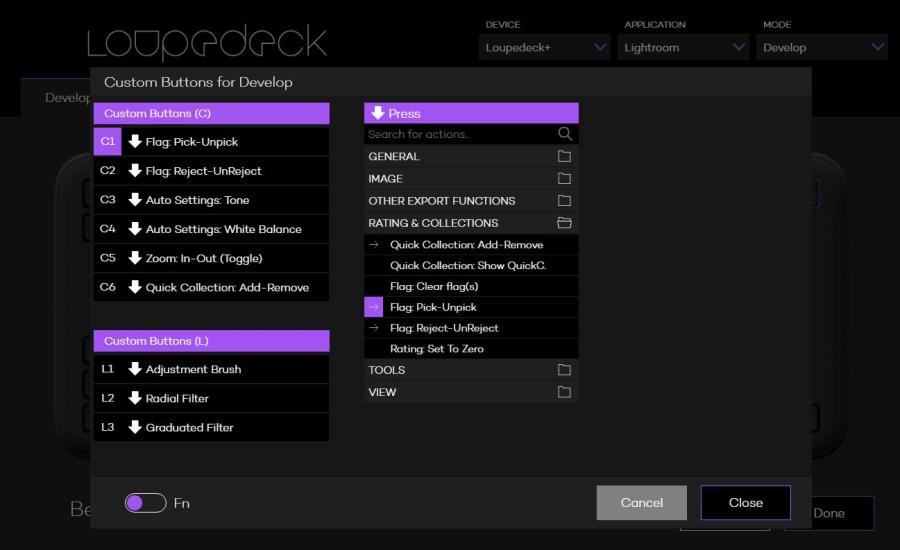
If you get a little too carried away customising buttons, you can always revert to the console's default settings.
Conclusion
We’ll reserve our final judgement regarding the console’s reliability and software compatibility in time. But, based purely on upgrades to the physical build quality, plethora of new customisation options and the promise of more supported software, fans of the original Loupedeck will only find improvements here. Whether or not you decide to upgrade may well hinge on how much use your existing editing console gets, but if you really click with the Loupedeck system, it’s hard to go back to the conventional keyboard and mouse.
If you’re buying into Loupedeck for the very first time, it seems clear that the Loupedeck+ is the definitive offering. It’s a lot like a classic album that's been remastered – the tunes are familiar, but the overall experience is enhanced.
About the Author
Mike Harris is Wex Photo Video’s production editor and is an experienced journalist with a passion for motorsport photography. You can view his portfolio via @MDHarrisPhoto on Instagram.


